
The DnB Spare app is a great application and one I use
regularly. The application is function rich, with an abundance of options.
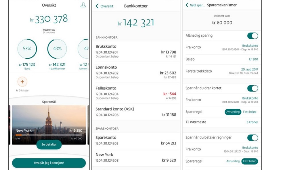
One of the features is to set up a savings account with an accompanying savings goal based on user specified mechanics. This can activate automatic savings when you pay bills, use your debit card or at set time intervals.
In this case study the focus will be the fourth mechanic called Impulse Saving.
Challenge
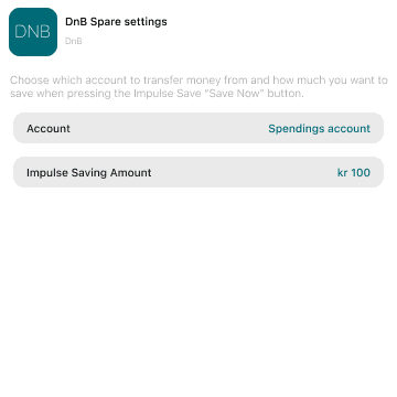
While using the DnB Spare app, in addition to the automatic mechanics, a user can manually specify an amount to transfer to their savings goal account through the function called "Impulse Saving".
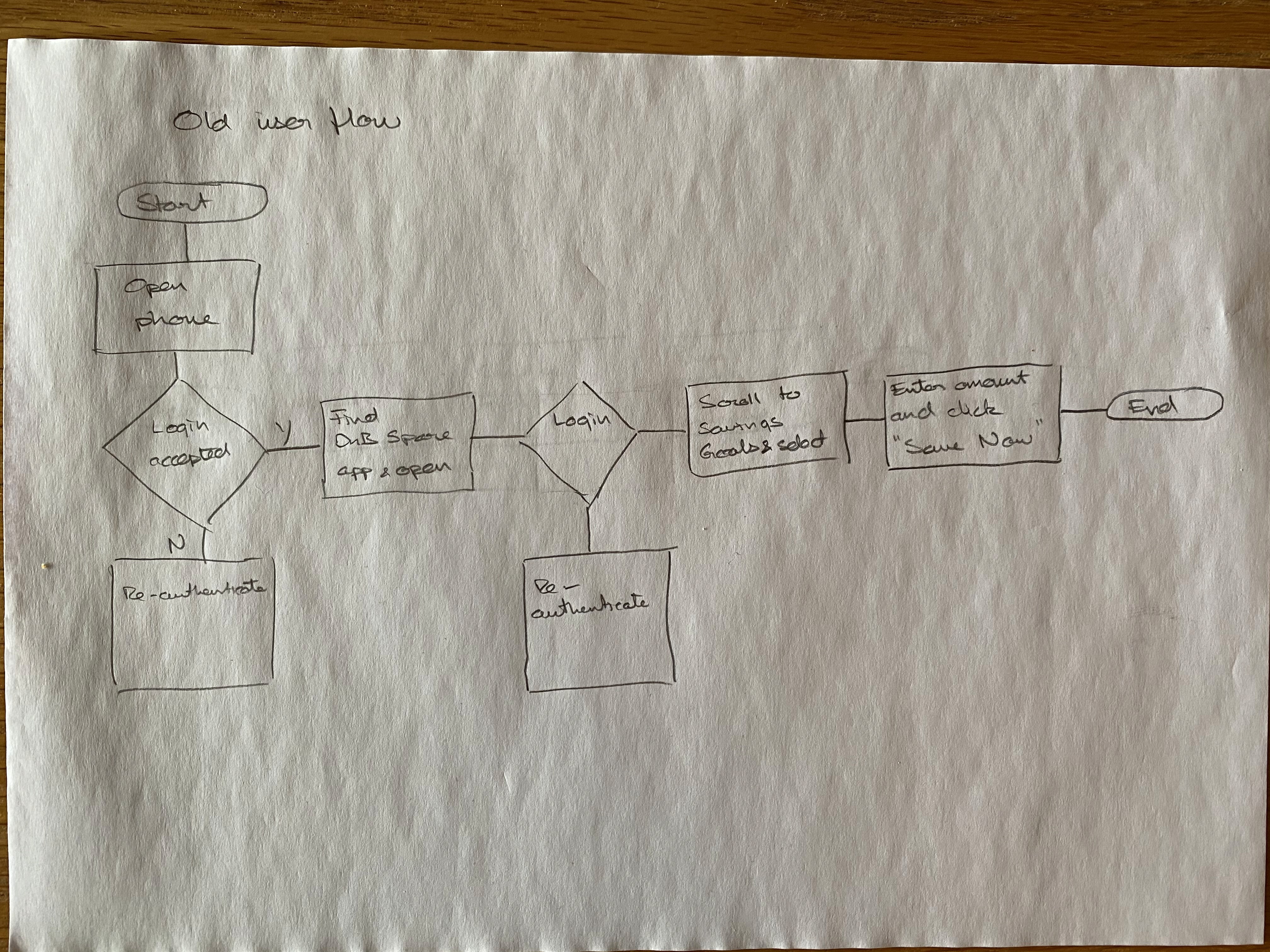
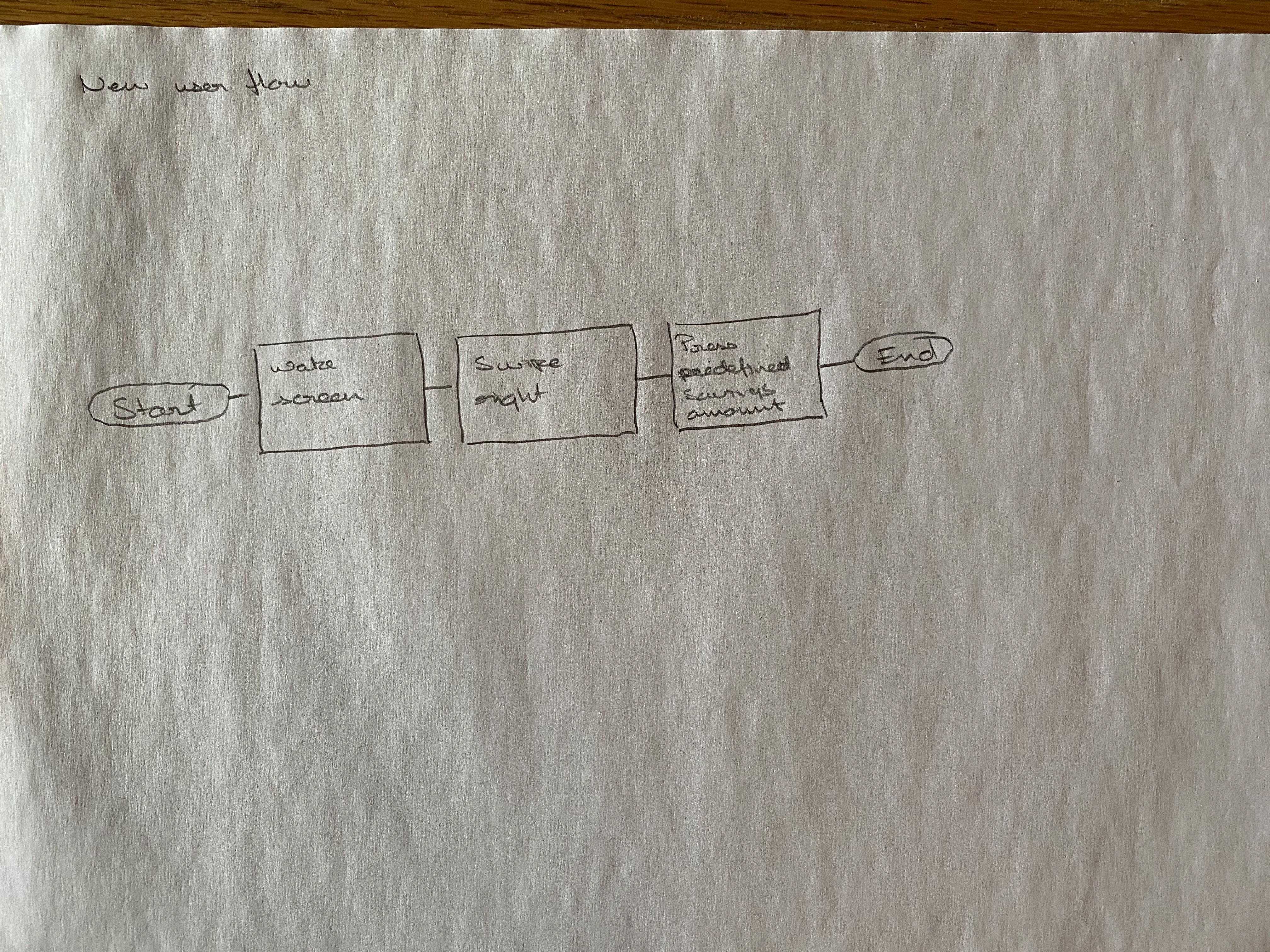
The process is as follows:
Unlock phone
Find DnB Spare App and open
Authenticate user
Scroll to your list of saving goals and select your desired savings goal
Type the amount you wish to transfer and press Save Now
This process is cumbersome and time consuming enough that making a habit of it
becomes difficult. It also diminishes the usability of the function. I wanted to find a
better process to improve the Impulse Saving function.

The process and research
Having an idea about how I wanted the new process and widget to work I set about making some wireframe drawings. These served as a good indication of what the end result would look like. It also provided a great way to make corrections and alterations throughout the design process as I learned more about widgets and their design principles. Apple's Human Interaction Guidelines and Developer Pages are a great resource.
During the research phase I also looked at other widgets and how they functioned in order to get a better understanding of which elements one could add and which variables to take into account. For example the small widgets only have a single tap target, while medium and large can have several tap targets. It's recommended not to have too many tap targets to ensure the user manages to hit their intended action.
The Apple guidelines also underlined the importance of simplifying your widgets as much as possible. This makes them more useful in the context of swiping through your various home pages. It is also meant as an alternative interaction with the app that can be accomplished without opening up the actual application. That being said, it should not be a copy of the app itself. Therefore it's important to design something functional and value adding that removes the need to open the app, but allows you to interact with the app directly.
As this is a project that I have embarked on at my own initiative I don't have the insight or resources DnB have. Had I, then the research phase would have been much more extensive. Access to user testing, contextual inquiries and data to back the initial challenge and viability of it. I have not been in contact with DnB in regard to this project, nor have I been commissioned.
Design iterations
The key goal was to simplify the process. With the way Widgets work on iOS 14, I could drastically reduce the number of steps in the user flow.

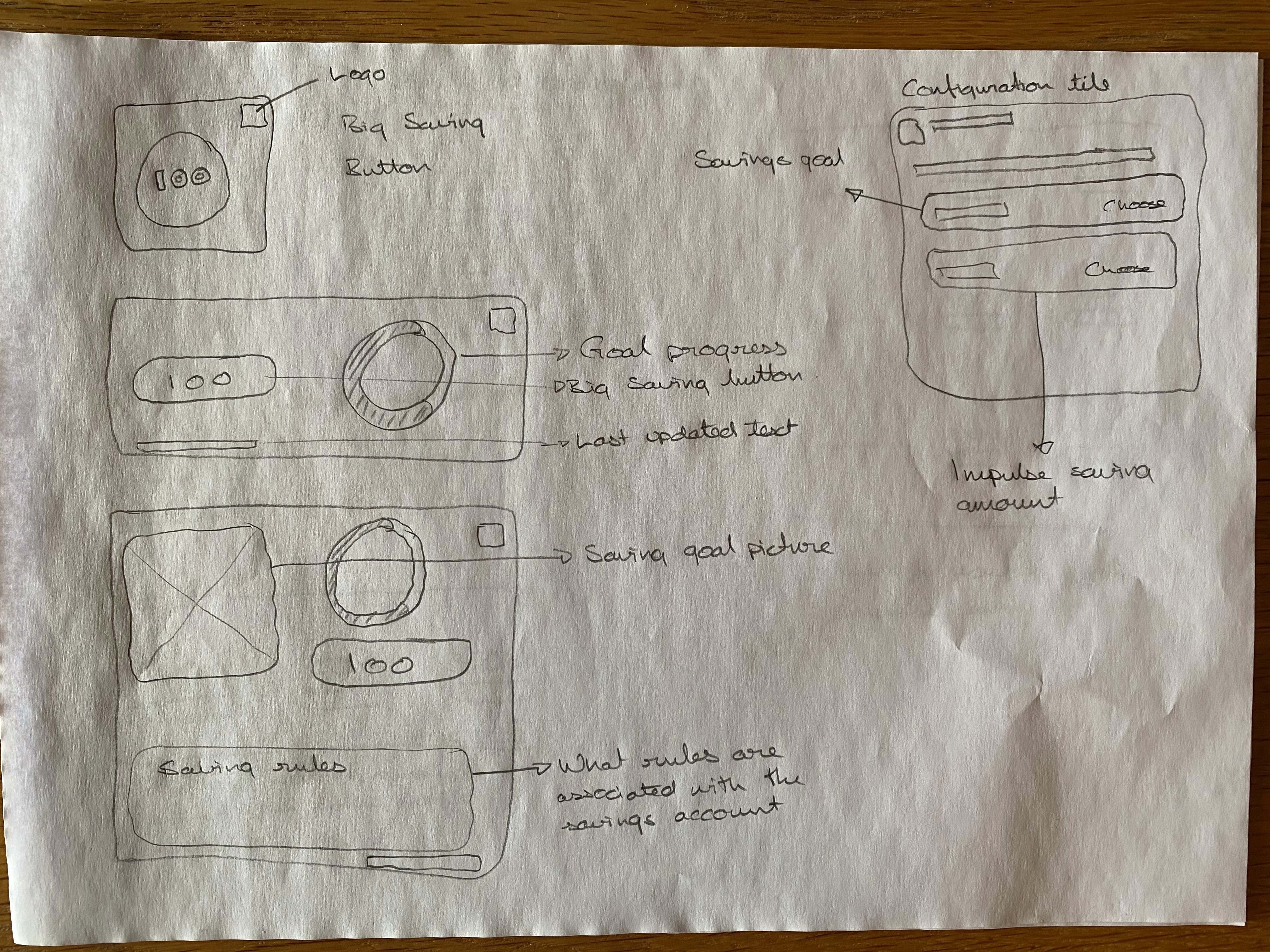
With the mental model of the widget process in my head, and the simplified user flow I started designing the actual widgets.

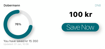

Keeping the tap targets in mind, I wanted to design all three widget sizes while trying to stay true to the functionality available relative to the widget size. The tap target "restrictions" also helped me decide on which wireframe was the most feasible. The entirety of the Small widget is tap target - saves printed amount. On the Medium and Large widgets thers enough space for more interactions and tap targets.
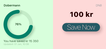

The translucent green, red and purple coloured areas represent the tap targets. Green takes you into the application so you can amend or view the
progression of your savings goal. The red does the same as on the Small widget - saves the printed amount The purple area takes you to the settings of the DnB Spare app so you can change the saving mechanics or picture
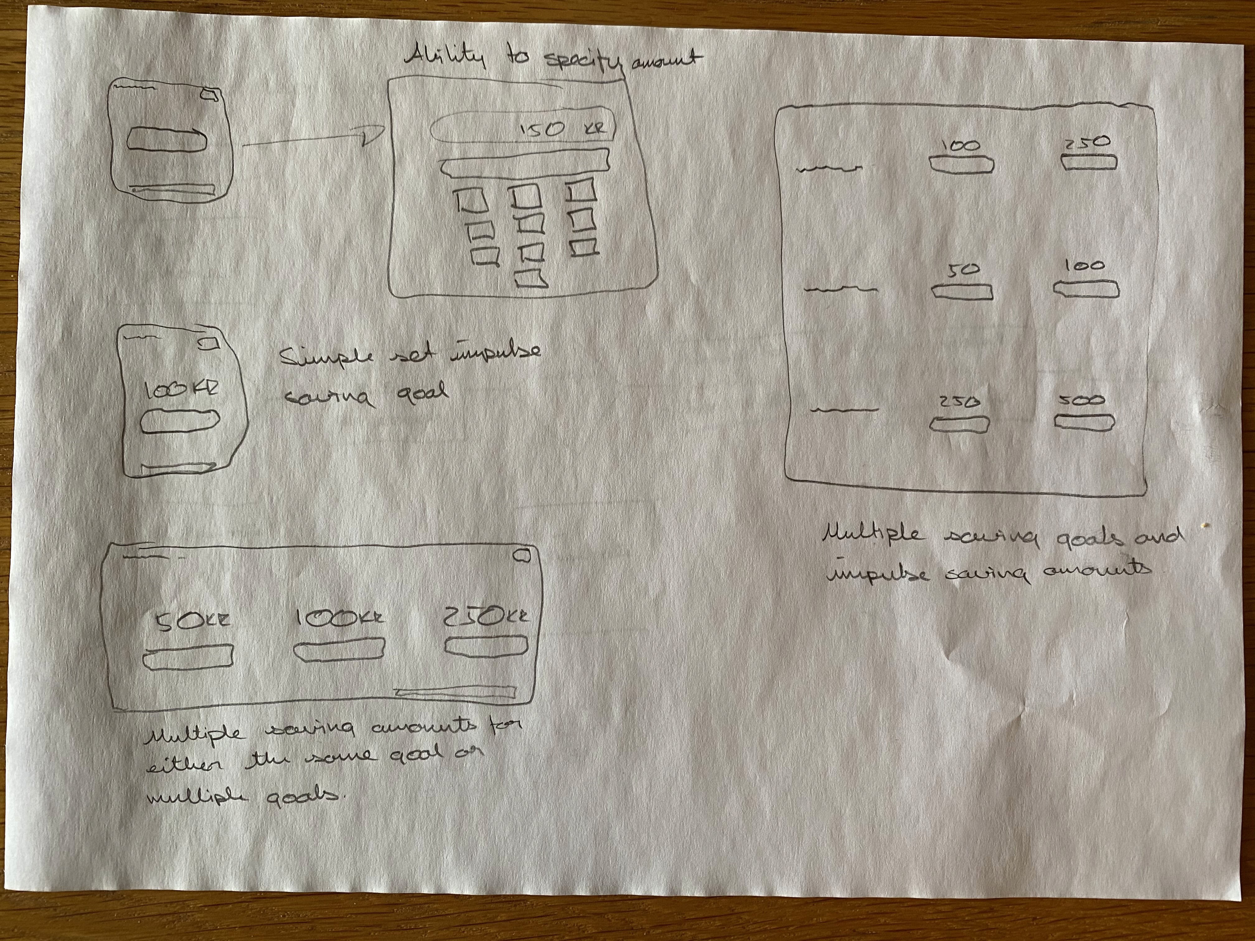
The next part was to create the configuration tile. With regards to the research, I wanted to ensure that the widgets were as simple as possible, yet conveyed their purpose clearly. Therefore the first wireframe idea was discarded as it included multiple saving goals. By focusing on only one savings goal, the widget configuration tile becomes much easier to understand for the end user, and avoids complexities in regards to back-end programming.
Another important part of a project, especially larger projects and when working in teams, is to establish a stylesheet as well as a component library. This ensures that colours and objects in the design stay consistent throughout, regardless of who is making changes. It also allows for easy alteration of a common colour scheme throughout the design by changing just one base element. This project doesn't need a very large stylesheet or component library, but it's good practice to get into the habit of making one regardless of the size of the project. It makes designing much easier and smoother.

Conclusion
Looking at the end solution, I'm happy with the result. The user flow to complete an impulse saving was decreased from a necessary six steps to two. It also avoids potential technical issues like unlocking your iPhone or authenticating in order to access the DnB Spare App.
There was definitely more to making the widget than first met the eye. This allowed me to learn a great deal more about how the thought process and design variables involved in designing widgets. The process also highlighted variables that should be taken into consideration and how to more effectively create a widget from a designer point of view while still thinking about the user and how they interact with an application.
Seeing as I don't have insight into the authorisations necessary for monetary
transactions, I have to take into consideration that there could be some limitations to making a widget like this work. Does every transaction have to be authenticated, even when the transfer is between accounts of the same owner? Can authorisation be preemtively given for a maximum amount per day? If the former is true, then what are the limitations around initiating an authorisation directly when activating the widget? If the latter, then where would one agree to the terms of service to allow a set maximum transfer amount?
Designing the widget in this case was probably the easiest part. While the backend coding and governance is presumably the biggest hurdle. It would have been very interesting to have a look behind the curtain at DnB to see how they would attack this challenge - is it feasible at all?
© Henrik Voss 2025